July 18, 2012

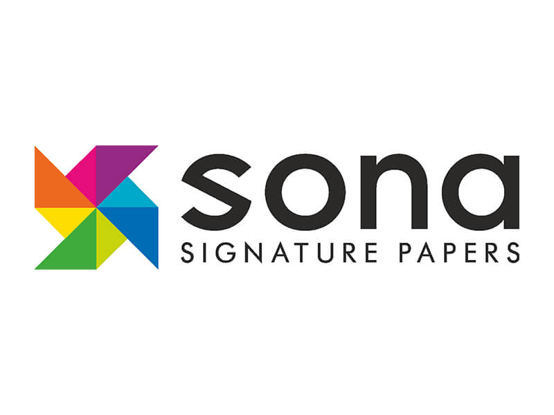
Sona Commercial Pvt Ltd, the market leader in fine paper has unveiled its new brand identity. The main objective of this exercise is to mark the evolution of the company through the last 46 years and to reaffirm the position of Sona, itsdiverse product portfolio, business philosophy and customer orientation.
It is felt that, as the company has undergone several up-gradations,anold logo representing the pin wheel, was also due for renewal. Additionally the signature did not communicate that Sona is a paper company. Keeping in mind that most of the communication is sent to designers, corporatesand printers who have a discerning eye, it was important for thelogo to be unique, cutting edge andinnovative.
Retaining the idea of the pinwheel symbol, the new mnemonic transforms the personality of Sona into one that is creative, energetic and youthful. A descriptor has been added to effectively communicate the business of the company. The new signature uses a custom designed sans serif font that reflectsthe modern outlook of the company.
The new signature is strong and distinctive with the presence to establish Sona as the overarching brand that encompasses international paper brands like Cordenons, Lenzing, Hansol, Won Bang, Arctic Paper and any others to come in future.


